What’s New
- Theme has been changed throughout the dashboard which includes but is not limited to the color, button style and shapes, navigation, toggle button and some other design changes.
- Previously there was just one onboarding integration page which has been segmented as three separate tabs to make the code integration experience more convenient and easier.
- A simple yet useful guided tour has been designed for the new users which will direct users to all of the sections one by one to let users set up everything necessary at the very beginning.

- Some notable changes have been made in the dashboard graph section.
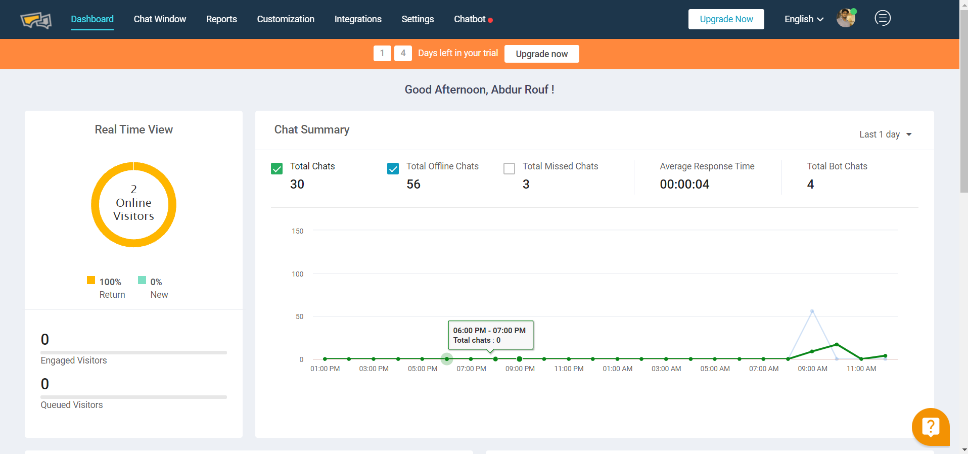
- The first graph showing visitors’ chat summary has been changed from area graph to line graph to make it more relevant.
- The real-time view graph has been redesigned and renamed as Real-time view. Some redundant data has been removed to make it more concise and clutter-free.
- The channel-based charts graph has been optimized and now users can add up to 7 different channels. Theme color has been changed to make it more relatable with the channel type
- Two new graphs: (that show visitors Map by country) have been added in the third row of the page to add more functionality in terms of data visualization.
- Agents graph/table has been moved upwards (from 3rd to 2nd Row) to better highlight this portion. There was a token graph in that place which has been omitted from the dashboard. Now users can go to the Settings > Chat Tags and see the number of tags in the same table (in 2nd column).
- Theme Section has been redesigned in the following way:
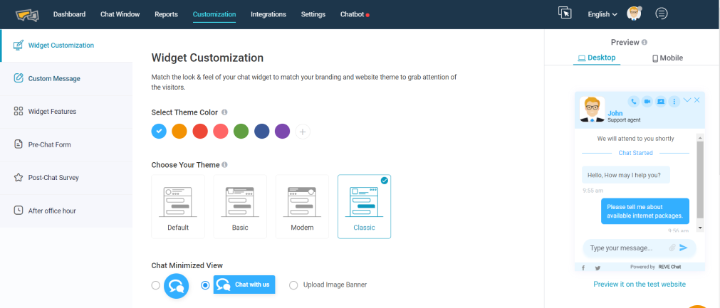
- The first two options under the customization section have been combined under one as “Widget Customization”
- Now users can see the theme changing option as well as other options like banner, button, color change and everything else under the same section and optimize those with more convenience.
- The chat window has been renamed as “Widget Feature”. The design of this whole section has been revamped by making the design more simplified and clutter-free.
- Previously “after office hour” Section had all the messages and office hour configuration options. To make it more relevant and simplistic only “office hour configuration option” has been kept under the “after office hours” segment. The rest of the message has been moved to a new section under customization named “Custom Messages”. Some of the pre-chat form messages have also been shifted to keep them consistent and more relevant.
- A whole new set of icons have been deployed which are better in terms of design and relevance.

- UX Changes: Some notable UX changes have been made throughout the dashboard sections consistently which include but are not limited to changing the toggle button design:
- In the old dashboard the toggle button design has some obvious improvement scopes in terms of both UI and UX. Throughout the new dashboard the toggle button design has been changed and made it according to the global standard (grey while disabled & green tick while switched on)
- Progressive disclosure has been implemented throughout the dashboard’s menu/option design. Progressive disclosure is an interaction design pattern that sequences information and actions across several screens (e.g., a step-by-step signup flow). The purpose is to lower the chances that users will feel overwhelmed by what they encounter. This was one of the biggest UX changes for menu design. Now users will only see the sub-options when those are relevant (main option is turned on).
- Now Chat Tag can be prioritized through assigning different color options with types of tag. In addition, the total number of tagging is shown along with the tag name which can give users a better view and reduces the necessity of the chat tag graphs which was present in the old dashboard.
- Integration View has been optimized. Now users can filter the integration according to the type (channel, CRM, CMS etc.) and also search for any specific integration in the newly added search box. This makes users’ jobs easy to find and integrate. In addition, shorts notes have been added along with every integration to give user a brief idea about that particular integration
- Information architecture has been optimized throughout the dashboard. In some places like the integration part grouping has been done so that users can relate & access those more conveniently. On the other hand, in some places like settings, expand/collapse design has been implemented to make it more findable and clutter-free.
- The first graph showing visitors’ chat summary has been changed from area graph to line graph to make it more relevant.
- The real-time view graph has been redesigned and renamed as Real-time view. Some redundant data has been removed to make it more concise and clutter-free.
- The channel-based charts graph has been optimized and now users can add up to 7 different channels. Theme color has been changed to make it more relatable with the channel type
- Two new graphs: (that show visitors Map by country) have been added in the third row of the page to add more functionality in terms of data visualization.
- Agents graph/table has been moved upwards (from 3rd to 2nd Row) to better highlight this portion. There was a token graph in that place which has been omitted from the dashboard. Now users can go to the Settings > Chat Tags and see the number of tags in the same table (in 2nd column).
- The first two options under the customization section have been combined under one as “Widget Customization”
- Now users can see the theme changing option as well as other options like banner, button, color change and everything else under the same section and optimize those with more convenience.
- The chat window has been renamed as “Widget Feature”. The design of this whole section has been revamped by making the design more simplified and clutter-free.
- Previously “after office hour” Section had all the messages and office hour configuration options. To make it more relevant and simplistic only “office hour configuration option” has been kept under the “after office hours” segment. The rest of the message has been moved to a new section under customization named “Custom Messages”. Some of the pre-chat form messages have also been shifted to keep them consistent and more relevant.
- A whole new set of icons have been deployed which are better in terms of design and relevance.
- In the old dashboard the toggle button design has some obvious improvement scopes in terms of both UI and UX. Throughout the new dashboard the toggle button design has been changed and made it according to the global standard (grey while disabled & green tick while switched on)
- Progressive disclosure has been implemented throughout the dashboard’s menu/option design. Progressive disclosure is an interaction design pattern that sequences information and actions across several screens (e.g., a step-by-step signup flow). The purpose is to lower the chances that users will feel overwhelmed by what they encounter. This was one of the biggest UX changes for menu design. Now users will only see the sub-options when those are relevant (main option is turned on).
- Now Chat Tag can be prioritized through assigning different color options with types of tag. In addition, the total number of tagging is shown along with the tag name which can give users a better view and reduces the necessity of the chat tag graphs which was present in the old dashboard.
- Integration View has been optimized. Now users can filter the integration according to the type (channel, CRM, CMS etc.) and also search for any specific integration in the newly added search box. This makes users’ jobs easy to find and integrate. In addition, shorts notes have been added along with every integration to give user a brief idea about that particular integration
- Information architecture has been optimized throughout the dashboard. In some places like the integration part grouping has been done so that users can relate & access those more conveniently. On the other hand, in some places like settings, expand/collapse design has been implemented to make it more findable and clutter-free.
- Report Section Changes: Some New graphs have been added in the report section as given below:
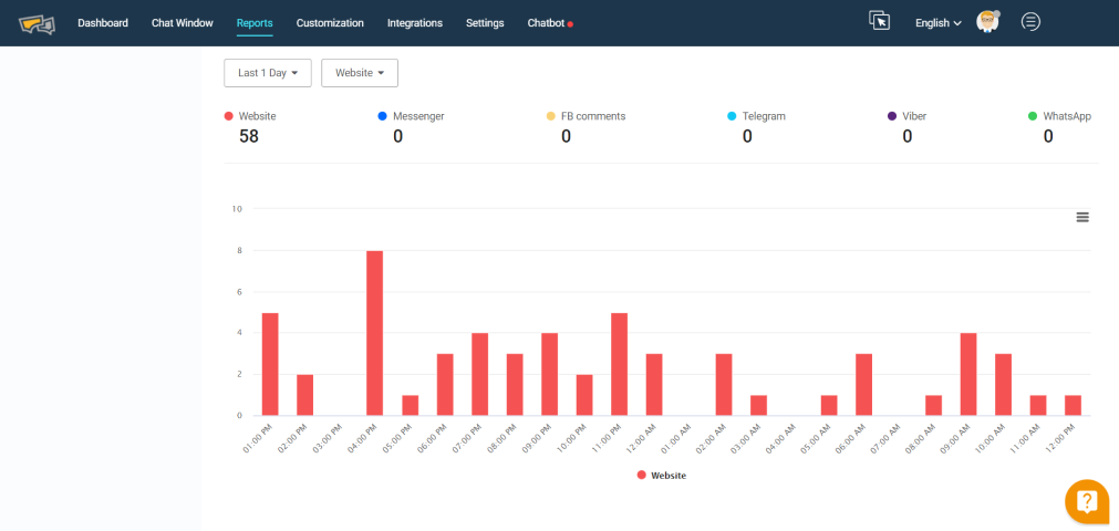
- The first graph of the report section, chat overview has been optimized from the previous one. Here channel-wise filtering capability has been added to let users track the channel wise activity more effectively.
- Three New Graphs have been added under the summary menu of the reporting section (just beneath the chat overview in reports>Summary).
- The first in this series is a graph of call & co-browsing. Here the channel-wise and day wise filtering capability has been added. User can see day wise history of voice/video chat/co-browsing and screen sharing detail through this
- The second one in this series is the chat metrics which can be filtered for days and channels. Here users can view the average response time, average chat duration and average queue time altogether. This graph will be specifically helpful for having a brief view of these metrics and act accordingly without going into detail reporting.
- The third one in this lineup is an omnichannel graph where users can see the graphs of channel-wise chats. Users can filter data and channels to see any specific channel that they want.
- Chat satisfaction has been made a separate option under the Reports section (reports>chat satisfaction) which was previously under chats (reports>chats>chat satisfaction). Previously the total feedback and average rating were shown in the same graph. Here it has been divided into two separate graphs for better visibility.
- Under the report section (Reports>Agent Analytics>Activity) one agent availability graph has been introduced which can be filtered for days and agent wise. This depiction will help track the agent’s engagement level and do any quick changes required without digging down the details. Full details can be viewed by hovering at any point of the graph as below. The graph can be downloaded at any format by clicking on the hamburger menu/button placed on the top right.
- One visitor device info graph has been added in the visitor analytics section (report>visitor analytics) where users can see day wise chats for platforms (desktop/mobile). This will let businesses have a platform wise view and help them allocate resources accordingly.